Analyzing smartphone usage data with R - Part 2: Long Format
By Clara Vetter on Aug 10, 2022
In the first part of our tutorial series, we showed you how to get a better understanding of the top used apps by time, and how to plot changes in app usage duration over time. Here, we will look at your data in long format, another data aggregation type that you can download from the Murmuras Researcher Portal. As you will discover, it contains a looot of different kinds of information. Don’t worry, we will go through it step by step.
Setting up RStudio and preparing your data
We use RStudio as our work environment. If you want to follow along in RStudio, just download this zip-file containg the Rmd-file and practice datasets, copy it to your project directory, and open it in RStudio.
library(tidyverse)
library(lubridate)
Download the data
When downloading data from the Murmuras Researcher Portal, you have the choice between different formats and different granularity. To follow the steps below, choose long format and daily granilarity. This means, that the usage times will be summarized per day. It is also possible to summarize per hour. Single app sessions are summed up for each app respectively.
Set working directory
We have to tell R where to load data from. Set the working directory to your data folder: In the gray code block below, set the path behind the ‘<-’ in parentheses to the directory you saved the data to on your machine. Afterwards, click the little green arrow in the upper right corner of the gray code block.
path <- "/Users/Shared/r-intro-part2-data/"
knitr::opts_knit$set(root.dir = path)
Load data
Now we load the data into our R environment. The environment contains all variables that we define. You can see it on the right side of the R window. Copy the name of your dataset between the parentheses in the read.csv() function in the code chunck below. Afterwards, press the green arrow again.
# load data
long_format_daily <- read.csv("Testdata.csv")

# remove column with row numbers
#long_format_daily <- long_format_daily[2:ncol(long_format_daily)]
Inspect your data
It is always a good idea to inspect your data and to understand exactly what variables are included. Let’s assess the data.
{r, message = F}
# show the first few rows of the dataset
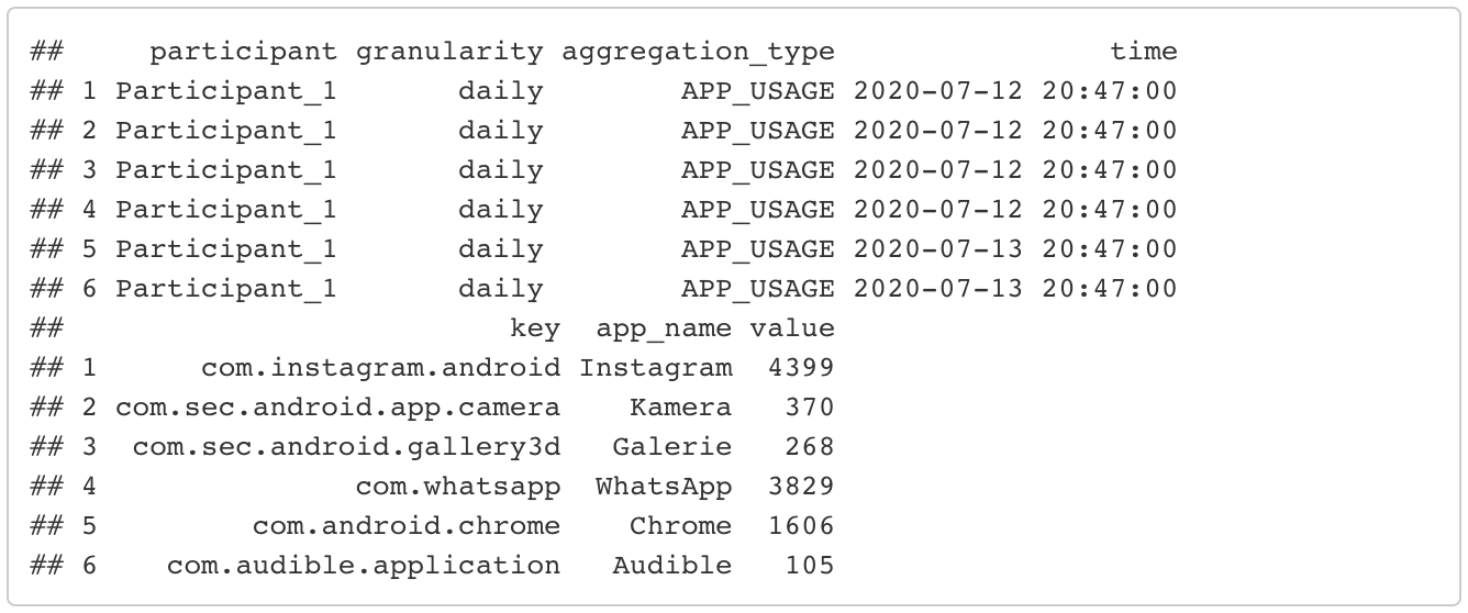
head(long_format_daily)
# show the last few rows of the dataset
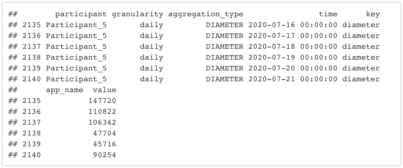
tail(long_format_daily)
# show column names of the dataset
colnames(long_format_daily)

# number of participants
length(unique(long_format_daily$participant))

As you can see, the dataset contains 8 columns: 1. id: each entry gets a unique id. 2. participant: each participant gets a unique identifier. 3. granularity: the granularity of data aggregation you chose when downloading the data. This column has the value “daily” in each row. Its main purpose here is to remind you of which granularity you chose. This can be useful if you have downloaded the data in both daily and hourly granularity. 4. aggregation_type: this is an important variable and we will look at it more closely in the next section It categorizes the many different types of information included in this dataset. 5. time: the date 6. key: when applicable, this is the name of the app as used in the app store. Opposed to app_name, this is the same in every language and, thus, should be used to group apps. In some types of aggregation, this is not applicable, e.g. phone_usage. In these cases, key has the same value as aggregation_type. 7. app_name: the app name. For some of the aggregation types, this is not applicable and therefore empty (e.g. phone usage, as it is a summary of the total device usage including all apps). 8. value: the value can have a different meaning depending on the aggregation type. For example, in the case of phone or app usage, it is the summed up duration in seconds. In the case of phone sessions, it’s the amount of times the phone was used.
Rename participants
To make the next steps easier to follow, we standardize the participant code to the format “Participant_running number). Note: You can also skip this step, especially for our test dataset, since we already did this beforehand.
for (i in 1:length(unique(long_format_daily$participant))){
  current_pp <- unique(long_format_daily$participant)[i]
  long_format_daily<- long_format_daily %>%
    mutate(participant = ifelse(participant == current_pp, paste0("Participant_",i), participant))
}
head(long_format_daily)
The different aggregation types
By now, you should have noticed, that the long format contains different types of data which are organized by the aggregation_type variable. But what does that even mean and what kinds of information are there? This easily explained by looking at what aggregation types there are. There are 10 different aggregation types:
unique(long_format_daily$aggregation_type)

PHONE_USAGE
This is the daily phone usage duration. Let’s compute the mean daily phone usage duration for each of your participants. We first have to filter the data so that we are left with only the rows that contain information about phone usage. Then we group by participant and summarize durations (stored in the value variable). If you are unfamiliar with the pipeline structure of dplyr, I recommend their easy to understand documentation. Of course, there are also other ways to compute these metrics, I am only showing you one way of doing so. Durations are given in seconds, but we can convert them to minutes by dividing by 60.
mean_phone_usage <- long_format_daily %>%
  # filter only the rows containing information about phone usage
  filter(aggregation_type == "PHONE_USAGE") %>%
  group_by(participant) %>%
  summarize(mean_daily_duration = mean(value)/60) %>% # in minutes
  # order from largest to lowest mean duration
  arrange(desc(mean_daily_duration))

head(mean_phone_usage)

PHONE_SESSIONS_COUNT
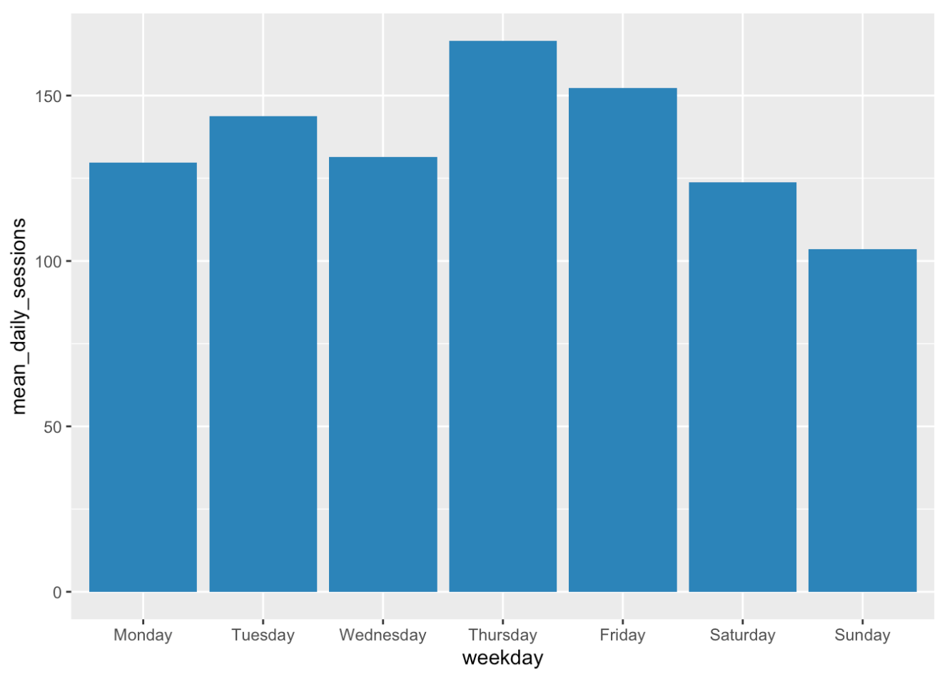
We can compute the mean number of phone sessions in a similar fashion. To make it a bit more interesting, let’s compare the different days of the week and plot the results. To do so, we have to add another column that contains information about what day corresponds to the date. Luckily, there are functions available for this and we don’t have to look it up ourselves.
mean_phone_sessions_weekday <- long_format_daily %>%
  # filter only the rows containing information about phone usage
  filter(aggregation_type == "PHONE_SESSIONS_COUNT") %>%
  # add column with corresponding weekday
  mutate(weekday = weekdays(date(time))) %>%
  group_by(weekday) %>%
  summarize(mean_daily_sessions = mean(value))

# order from Monday to Sunday
mean_phone_sessions_weekday$weekday <- factor(mean_phone_sessions_weekday$weekday,levels = c("Monday", "Tuesday", "Wednesday", "Thursday", "Friday", "Saturday", "Sunday"))
mean_phone_sessions_weekday <- mean_phone_sessions_weekday %>%
  arrange(weekday)

# plot the mean number of phone sessions per weekday
ggplot(data=mean_phone_sessions_weekday, aes(x=weekday, y=mean_daily_sessions)) +
  geom_bar(stat="identity", fill = "steelblue")
APP_USAGE and APP_STARTS
These two aggregation types are similar to phone usage and phone sessions. The difference is, that daily duration and daily number of sessions (starts) are counted for each app separately.
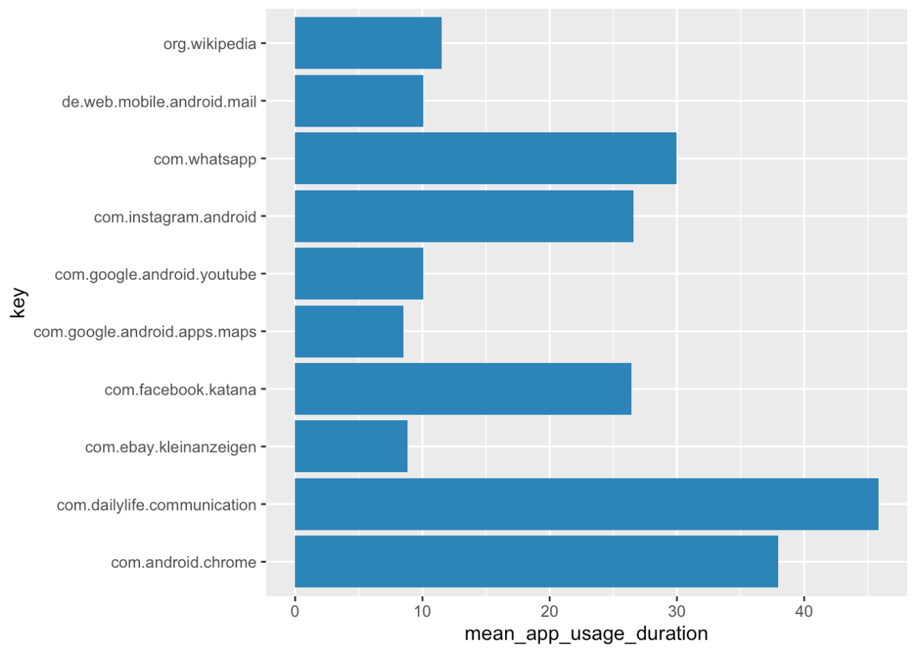
Are you able to compute the overall daily mean usage duration for each app across participants? And are the top 10 apps by usage duration the same as when looking at the amount of times the apps were started?
Here’s one way to do it:
# overall daily mean app usage duration
mean_app_usage <- long_format_daily %>%
  # filter the right data
  filter(aggregation_type == "APP_USAGE") %>%
  # remember: if you want to group by app, use key instead of app_name
  group_by(key) %>%
  summarize(mean_app_usage_duration = mean(value)/60) %>% # in minutes
  arrange(desc(mean_app_usage_duration))

# only the top 10 apps
top_apps_duration <- head(mean_app_usage, 10)

# plot it!
ggplot(data=top_apps_duration, aes(x=key, y=mean_app_usage_duration)) +
  geom_bar(stat="identity", fill = "steelblue") +
  coord_flip()
# overall daily mean number of app starts
mean_app_starts <- long_format_daily %>%
  # filter the right data
  filter(aggregation_type == "APP_STARTS") %>%
  # remember: if you want to group by app, use key instead of app_name
  group_by(key) %>%
  summarize(mean_app_starts_count = mean(value)) %>%
  arrange(desc(mean_app_starts_count))

# only the top 10 apps
top_apps_starts <- head(mean_app_starts, 10)

# plot it!
ggplot(data=top_apps_starts, aes(x=key, y=mean_app_starts_count)) +
  geom_bar(stat="identity", fill = "steelblue") +
  coord_flip()
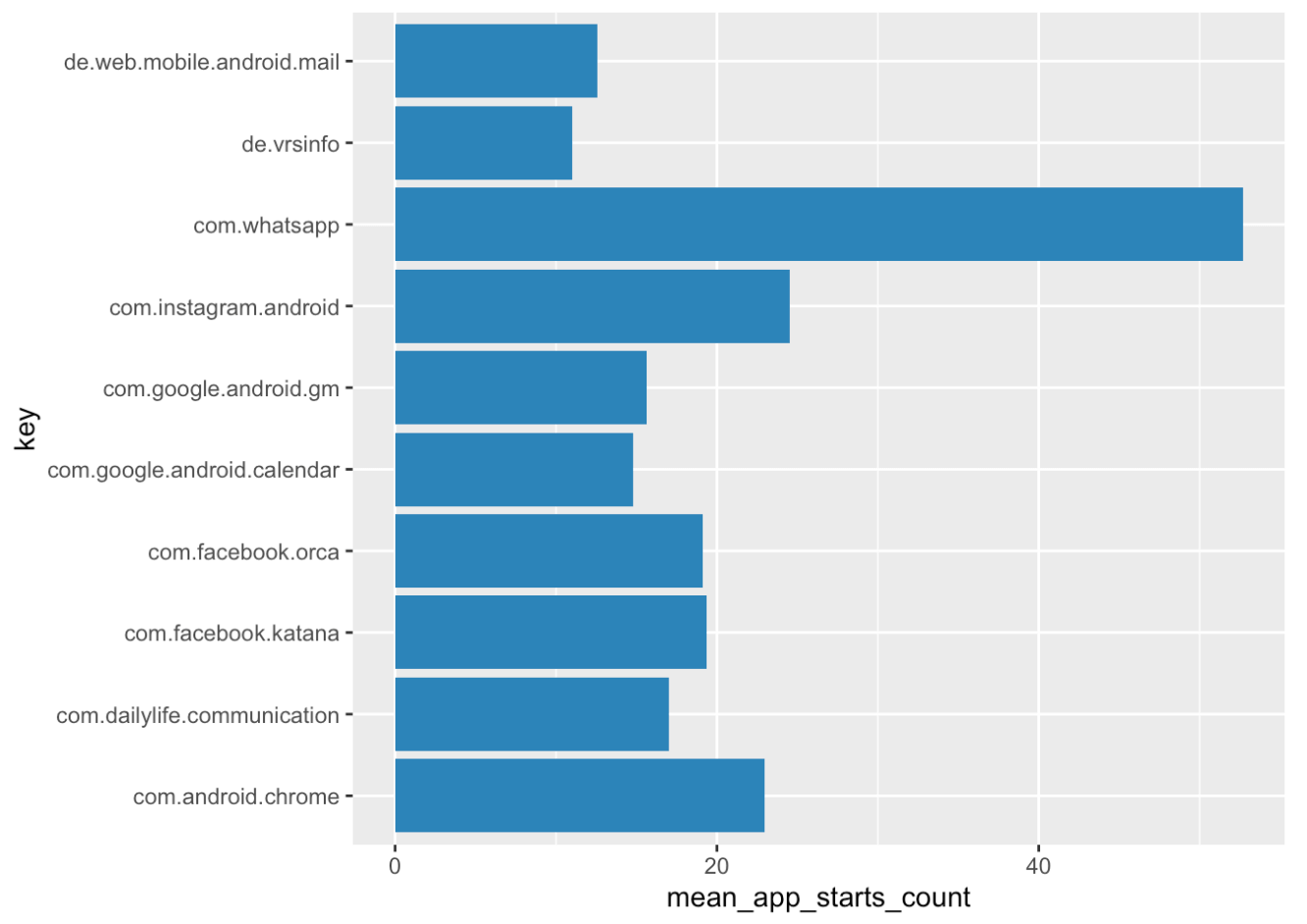
You might notice, that a lot of apps with ‘launcher’ or ‘systemui’ in their key are among the top apps. These usually correspond to the launch/home screen or similar and not a ‘real’ app of interest. You should consider excluding all of them before your analysis. You can use the filter() function, similar to how we filtered for aggregation type. The ‘!’ tells the function that we want to exclude the named apps. Depending on what apps you want to exclude, this should look something like this:
# exclude not relevant apps
long_format_daily_filtered <- long_format_daily %>%
  filter(!key %in% c("net.oneplus.launcher",
                     "com.sec.android.app.launcher",
                     "com.android.systemui"))
For the purpose of this tutorial, we already excluded these applications from our data prior to the analysis.
CATEGORY_USAGE and CATEGORY_STARTS
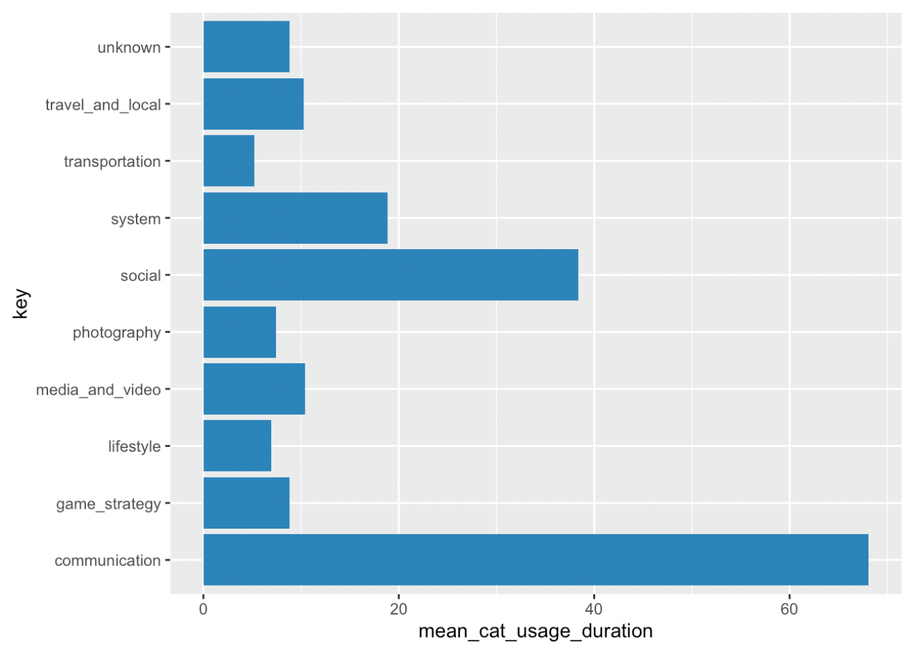
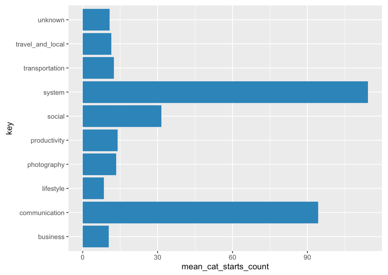
These two aggregation types can be used in a similar way as app usage and starts. The difference is that here, daily duration and starts are summarized for each app category as specified by the Google PlayStore. Just as the key variable identified the app, it now contains the respective category. You can follow the code snippets from the previous section to plot similar figures but for the categories. Which categories did your users use most? Note: It might happen, that category usage times and category starts in our test dataset don’t match the summed app usage durations and starts, as we included only the most used apps in this dataset.
# overall daily mean category usage duration
mean_cat_usage <- long_format_daily %>%
  # filter the right data
  filter(aggregation_type == "CATEGORY_USAGE") %>%
  # remember: if you want to group by category, use key
  group_by(key) %>%
  summarize(mean_cat_usage_duration = mean(value)/60) %>% # in minutes
  arrange(desc(mean_cat_usage_duration))

# only the top 10 apps
top_cats_duration <- head(mean_cat_usage, 10)

# plot it!
ggplot(data=top_cats_duration, aes(x=key, y=mean_cat_usage_duration)) +
  geom_bar(stat="identity", fill = "steelblue") +
  coord_flip()
# overall daily mean number of category starts
mean_cat_starts <- long_format_daily %>%
  # filter the right data
  filter(aggregation_type == "CATEGORY_STARTS") %>%
  # remember: if you want to group by category, use key
  group_by(key) %>%
  summarize(mean_cat_starts_count = mean(value)) %>%
  arrange(desc(mean_cat_starts_count))

# only the top 10 apps
top_cats_starts <- head(mean_cat_starts, 10)

# plot it!
ggplot(data=top_cats_starts, aes(x=key, y=mean_cat_starts_count)) +
  geom_bar(stat="identity", fill = "steelblue") +
  coord_flip()
MSCORE
This a legacy aggregation_type from the Menthal project. It’s used in the Menthal app to ascertain your “mood score.” If you are interested in this, have a look at Menthal app. Murmuras app does not use MSCORE, so you can safely ignore it.
LOCATION_POINTS
Analyzing smartphone data allows you to analyze people’s whereabouts as phones provide information in terms of GPS coordinates. The aggregation type LOCATION_POINTS gives you the number of location points sent by the user’s phone per day. This can vary depending on the phone model. Therefore, all location-based data should only be seen as an approximation. Still, it can give you an idea of where users are when using a certain app and about their mobility behavior.
DISTANCE_TRAVELED
This aggregation type summarizes daily distance traveled (in meters). It is estimated by summing the distance between all recorded location points. It is therefore dependent on how many points a certain phone model sends. Let’s plot on which weekdays our participants travel the largest distance.
distance <- long_format_daily %>%
  # filter the right data
  filter(aggregation_type == "DISTANCE_TRAVELED") %>%
  # add column with corresponding weekday
  mutate(weekday = weekdays(date(time))) %>%
  group_by(weekday) %>%
  summarize(mean_daily_distance = mean(value))

# order from Monday to Sunday
distance$weekday <- factor(distance$weekday,levels = c("Monday", "Tuesday", "Wednesday", "Thursday", "Friday", "Saturday", "Sunday"))
distance <- distance %>%
  arrange(weekday)

# plot the mean number of phone sessions per weekday
ggplot(data=distance, aes(x=weekday, y=mean_daily_distance)) +
  geom_bar(stat="identity", fill = "steelblue")
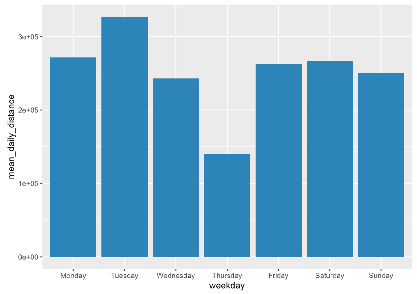
It would be interesting to see how travel data would look like during not-home-office periods. Perhaps an idea for future studies? The dip on Thursdays is also interesting to note.
DIAMETER
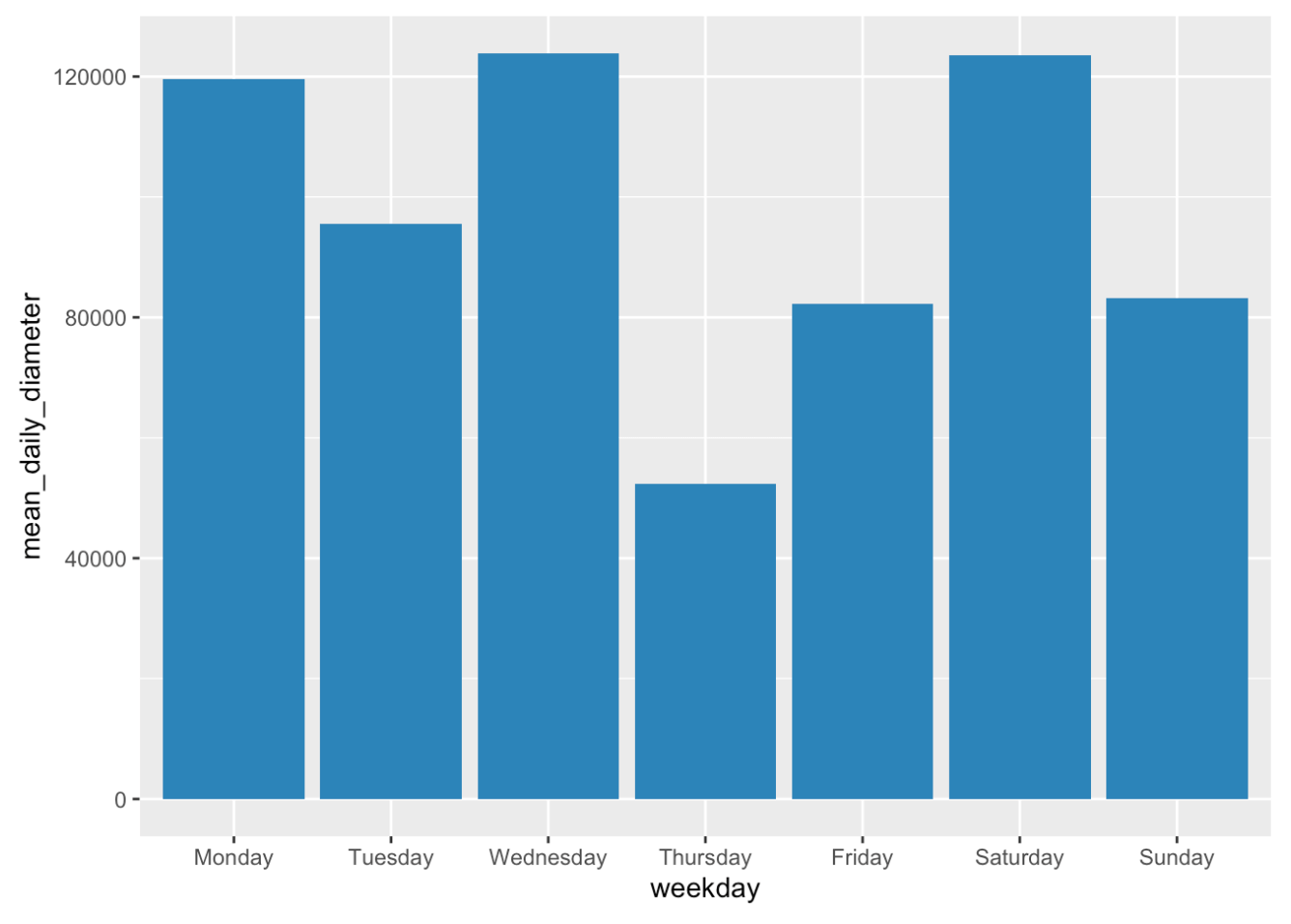
The diameter aggregation type displays the largest distance between two location points on a day. It indicates the size of the area in which a person moved. I would like to know whether we can observe the same trend for the travel area as for the distance traveled.
diameter <- long_format_daily %>%
  # filter the right data
  filter(aggregation_type == "DIAMETER") %>%
  # add column with corresponding weekday
  mutate(weekday = weekdays(date(time))) %>%
  group_by(weekday) %>%
  summarize(mean_daily_diameter = mean(value))

# order from Monday to Sunday
diameter$weekday <- factor(diameter$weekday,levels = c("Monday", "Tuesday", "Wednesday", "Thursday", "Friday", "Saturday", "Sunday"))
diameter <- diameter %>%
  arrange(weekday)

# plot the mean number of phone sessions per weekday
ggplot(data=diameter, aes(x=weekday, y=mean_daily_diameter)) +
  geom_bar(stat="identity", fill = "steelblue")
Adding emplyment status to distance dataset
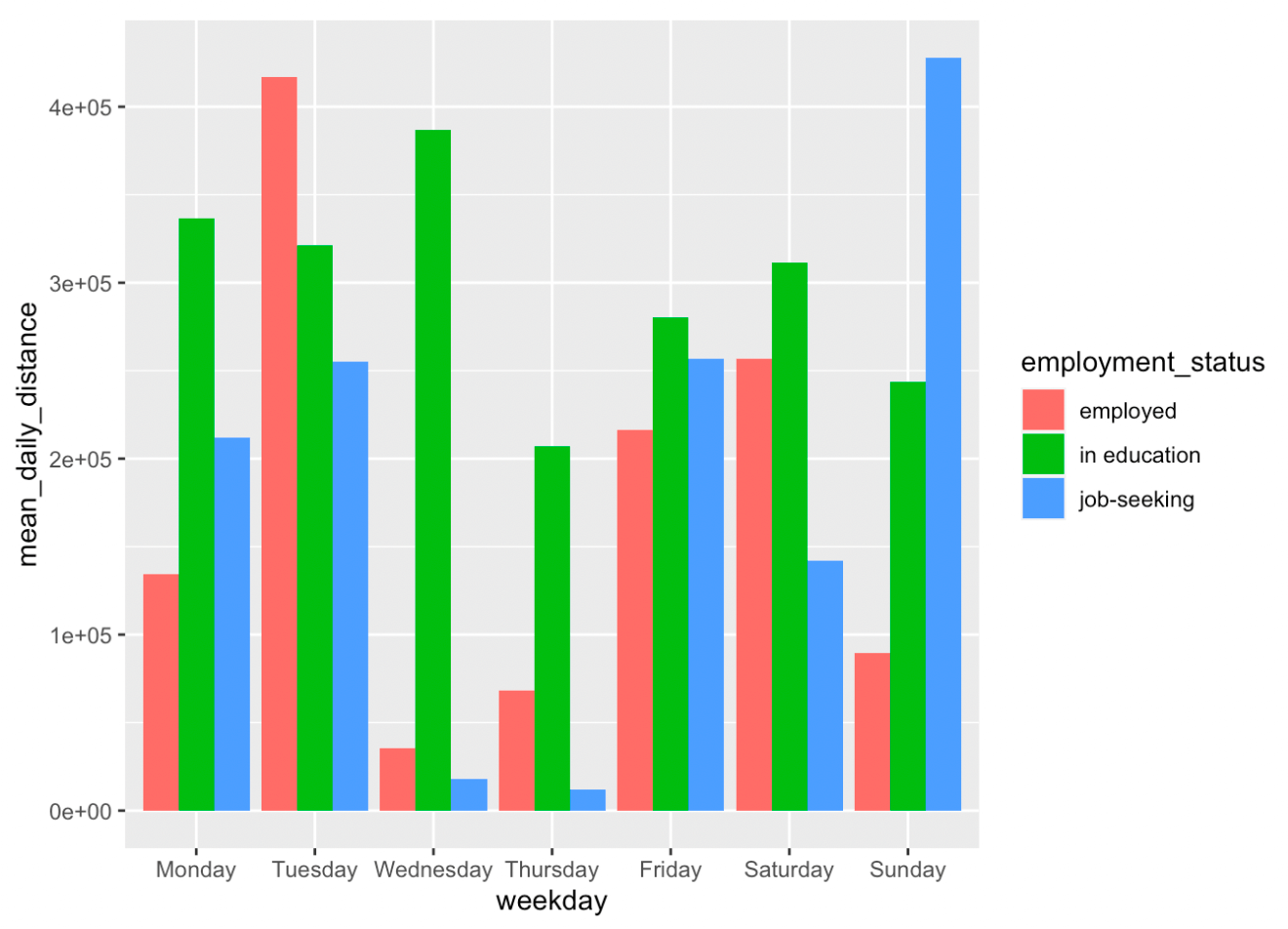
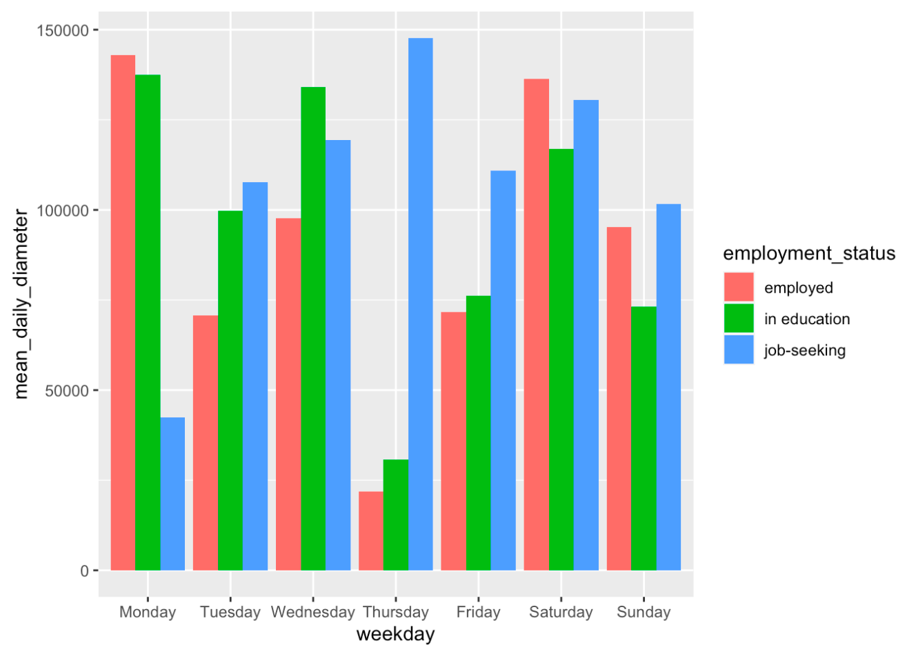
For the grand finale, we demonstrate how to integrate demographic data into your analyses. Let’s compare whether students show differences in their traveled distances and diameters of travel area compared to others. First, we import the demographics data. You can download it from the Murmuras Researcher Portal, just as the other data. Next, we extract employment status and add it as a new variable to our travel distance and diameter datasets. Note that your demographics dataset could look different from our test file. For illustration purposes, we did not include all onboarding questions. Also, you will have to match the questionnaire data to the smartphone data by user_id, here we do it by participant.
In our test sample, we have 3 students (employment_status = “in education”) and two employed people. Of course, to really investigate differences, we would need a way bigger sample but the analysis steps are essentially the same. Finally, we again plot our results.
# import demographics data
demo <- read.csv("Testdemo.csv")

# extract employment_status
employment <- demo %>%
  select(participant, employment_status)

# add employment_status to distance dataset
distance_es <- long_format_daily %>%
  # filter the right data
  filter(aggregation_type == "DISTANCE_TRAVELED") %>%
  left_join(employment) %>%
  # add column with corresponding weekday
  mutate(weekday = weekdays(date(time))) %>%
  group_by(weekday,employment_status) %>%
  summarize(mean_daily_distance = mean(value))

# order from Monday to Sunday
distance_es$weekday <- factor(distance_es$weekday,levels = c("Monday", "Tuesday", "Wednesday", "Thursday", "Friday", "Saturday", "Sunday"))
distance_es <- distance_es %>%
  arrange(weekday)

# plot the mean number of phone sessions per weekday
ggplot(data=distance_es, aes(x=weekday, y=mean_daily_distance, fill = employment_status)) +
  geom_bar(stat="identity",position=position_dodge())
# diameter dataset
diameter_es <- long_format_daily %>%
  # filter the right data
  filter(aggregation_type == "DIAMETER") %>%
  left_join(employment) %>%
  # add column with corresponding weekday
  mutate(weekday = weekdays(date(time))) %>%
  group_by(weekday,employment_status) %>%
  summarize(mean_daily_diameter = mean(value))

# order from Monday to Sunday
diameter_es$weekday <- factor(diameter_es$weekday,levels = c("Monday", "Tuesday", "Wednesday", "Thursday", "Friday", "Saturday", "Sunday"))
diameter_es <- diameter_es %>%
  arrange(weekday)

# plot the mean number of phone sessions per weekday
ggplot(data=diameter_es, aes(x=weekday, y=mean_daily_diameter, fill = employment_status)) +
  geom_bar(stat="identity",position=position_dodge())
That’s it for the second part of our tutorial series. Good luck with your own data analyses! Don’t hesitate to reach out if you have questions concerning the data and how to handle it. Also check out the previous tutorial in which I describe the app sessions data format.